Have you ever heard of Design tokens? Design tokens, to put it simply, are all the CSS-related values of your product that are kept in one location and utilized as needed.
Simple? Isn't it?😅
And it is more simple to use and implement also.
Let's deep dive and learn how to create one 🚀🚀.
We will be creating a React app with a CSS-in-JS library named Styled Components.
Styled Components Basics would be helpful if you are new to the Styled Components.
Just want to let you know, we will not learn how to write code instead we will be focusing on the practice to store and create design tokens in an app.
Let's begin the steps: -
-
Install Styled Components and create a new React app using the [Guide to construct a new React App] (https://create-react-app.dev/docs/getting-started/).
OR
You may make use of your ongoing project.
-
Create a basic component, for now, I am creating a profile card. Make a profile card as seen below without worrying about the design token.
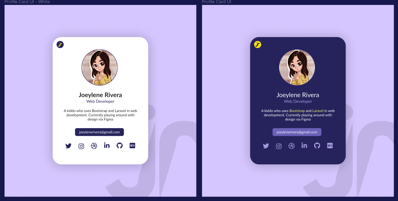

If you are creating on your own, otherwise 👇
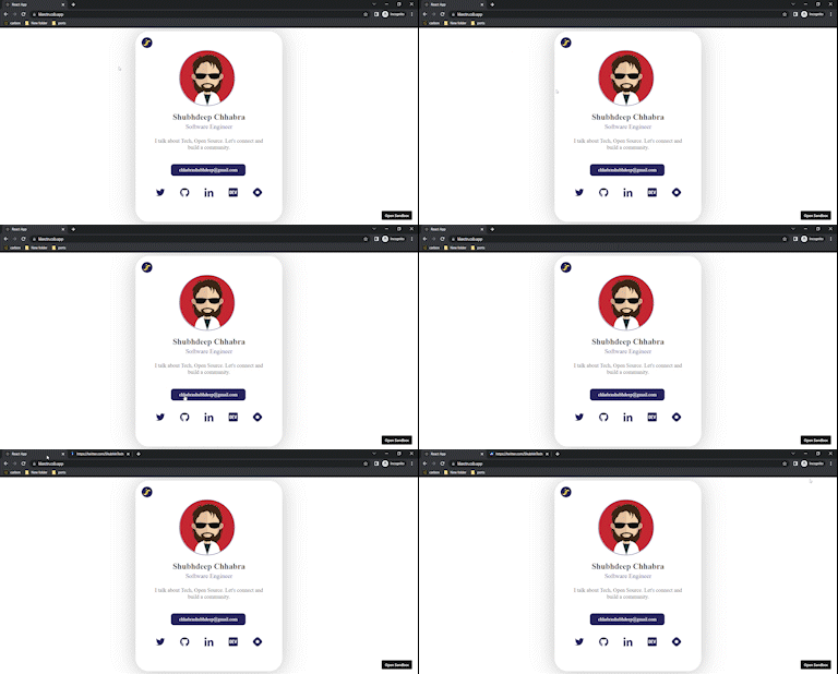
Here is the code for that component. Codesandbox link
There are no design tokens in this.

-
Now there is a task for you -> change the color of the button and all social media links and decrease the size of the text by 2px.
Hope you completed the task, So I want to ask my last question here - don't you feel that you kept changing the same value at different locations? If yes, I think you understand the need for design tokens.
Let's create some.
Here is the Codesandbox link of the project but with design tokens.
Understanding how we developed the design token is crucial. For the sake of the example, we made an object with two keys that represented the theme: light and dark.
export default {
	light: {
		fontSize: {
			text: {
				small: 20,
				medium: 23,
				large: 30,
			},
			button: {
				small: 15,
				medium: 17,
				large: 20,
			},
		},
		color: {
			text: {
				primary: '#252525',
				secondary: '#26235C',
				white1: '#FFFFFF',
			},
			background: {
				primary: '#FFFFFF',
			},
			border: {
				primary: '#26235C',
			},
			button: {
				blue1: '#26235C',
			},
			icon: {
				blue1: '#26235C',
				yellow1: '#F7DF1E',
				black1: '#000000',
			},
		},
		fontWeight: {
			small: 200,
			medium: 400,
			large: 700,
		},
	},
	dark: {
		fontSize: {
			text: {
				small: 20,
				medium: 23,
				large: 30,
			},
			button: {
				small: 15,
				medium: 17,
				large: 20,
			},
		},
		color: {
			text: {
				primary: '#FFFFFF',
				secondary: '#A79AE0',
				white1: '#FFFFFF',
			},
			background: {
				primary: '#26235C',
			},
			border: {
				primary: '#A79AE0',
			},
			button: {
				blue1: 'rgba(144, 130, 236, 0.65)',
			},
			icon: {
				blue1: '#A79AE0',
				yellow1: '#F7DF1E',
				black1: '#000000',
			},
		},
		fontWeight: {
			small: 200,
			medium: 400,
			large: 700,
		},
	},
}
You can see that we assigned values for text size, button color, background color, and all other CSS attributes used in our profile card here.
And these are used everywhere instead of hard coding the colors.
We now have a central location for changing the CSS properties like button color, etc wherever needed.
Isn't that easy? And design tokens are exactly this.
Although not all aspects, such as having distinct styles for various screen sizes, are covered by this example. But understanding is sufficient to begin making your own Design Tokens.
Depending on the product, a design token may have a variety of layers.
That's the end of this blog.
I hope you find this helpful. 🙌 Please tell me in the comments. 📪
Happy reading
For more of this type of stuff, follow me on X — @ShubhInTech
